Pantone colours are needed when a shade, such as the company logo colour, must stay recognisable across different materials, or when the four CMYK inks cannot reproduce certain tones, such as metallics and fluorescent colours. For companies in Cantù and the province of Como we assess case by case whether it is worth using them.
A choice that depends on the project
A spot colour can affect production, so we decide it together with the partner printer. We work for companies between Como, Brianza and Milan and coordinate the topic with the brand's visual identity and logo.


A screen emits light, paper reflects it: that is why printed colour looks different. Inks, paper and finish also matter. For companies between Como and Milan we do not promise identical colours, but we use proofs and checks to get as close as possible.
A print-ready PDF is exported in CMYK, with embedded fonts, suitable images, bleed and crop marks, according to the printer's requirements. In Cantù, in the province of Como, we prepare PDFs for catalogues, brochures and leaflets.
You gather the document, images and fonts in a single folder, or convert the text to outlines, so the job opens identically at the printer. For clients in Cantù, Como and Brianza we archive every project for future reprints.
To approve drafts and print proofs you check text, images, margins and colours and give a single written confirmation before production. Colour on paper does not match the screen. In Cantù we follow this stage for companies in Como, Brianza and Lugano.
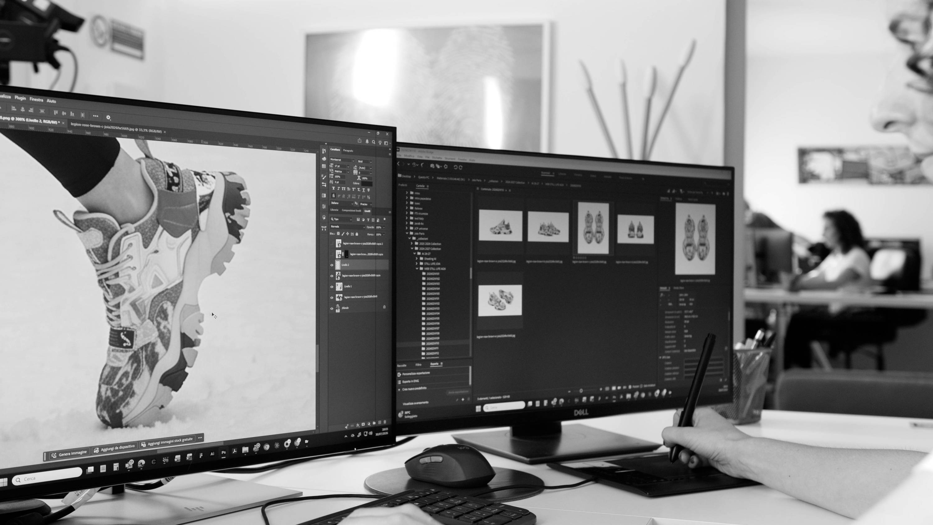
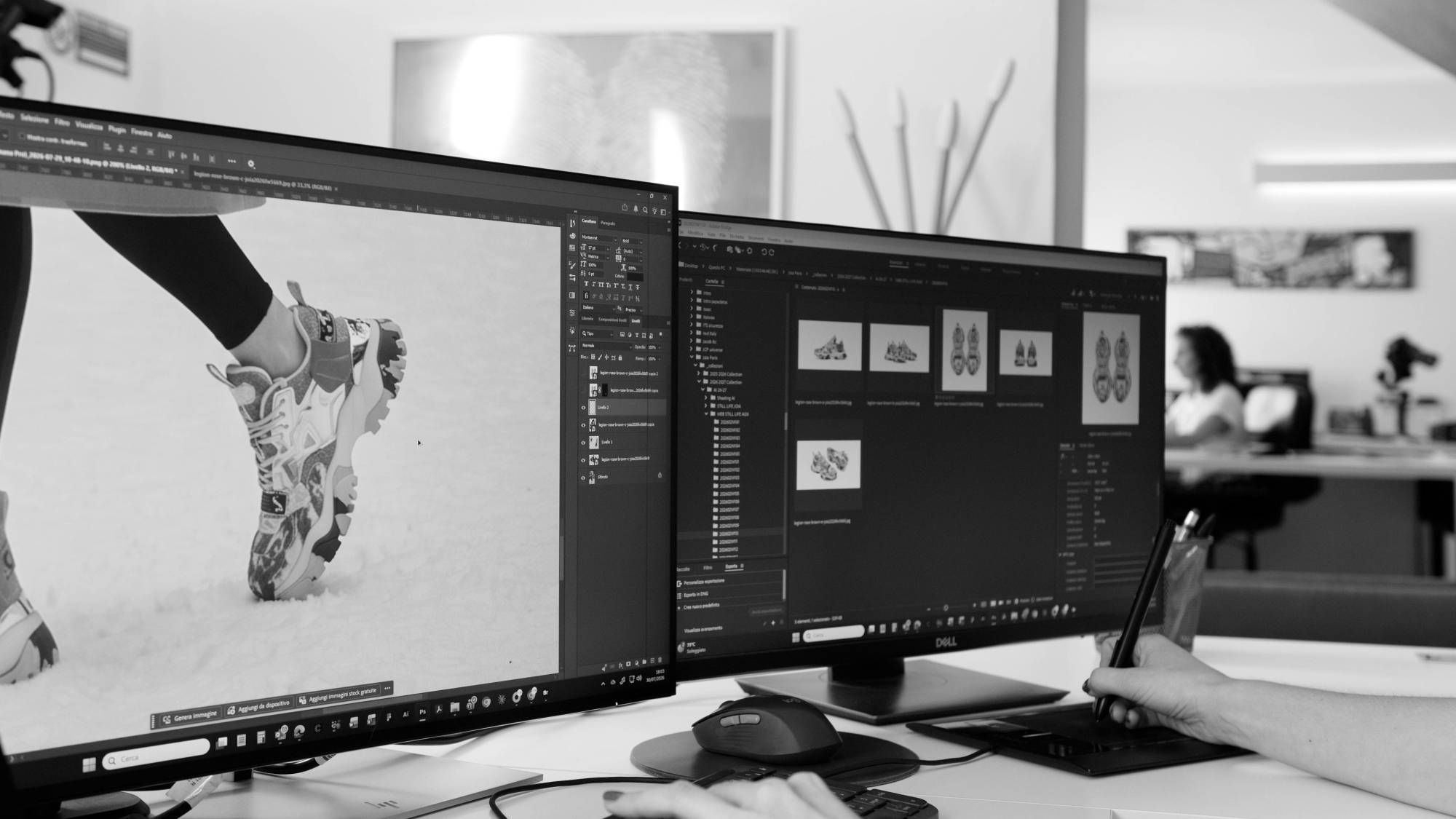
You need product photos that are consistent in lighting, framing and background, plus a few lifestyle images, planned together with the layout. Our in-house studio in Cantù, in the province of Como, produces the photo shoots for the catalogues of companies in Brianza and Milan.