How do you choose readable fonts and typographic hierarchies?

To choose readable fonts and typographic hierarchies you need to start from who is reading and where: a few well-matched typefaces and clear heading levels are worth more than a thousand effects.

In the catalogues and brochures we lay out in Cantù for companies in Como and Brianza, typography is the part you notice least when it works and most when it is missing.
Hierarchies

The levels of a well laid-out text

Whoever browses must understand at once what to read first.

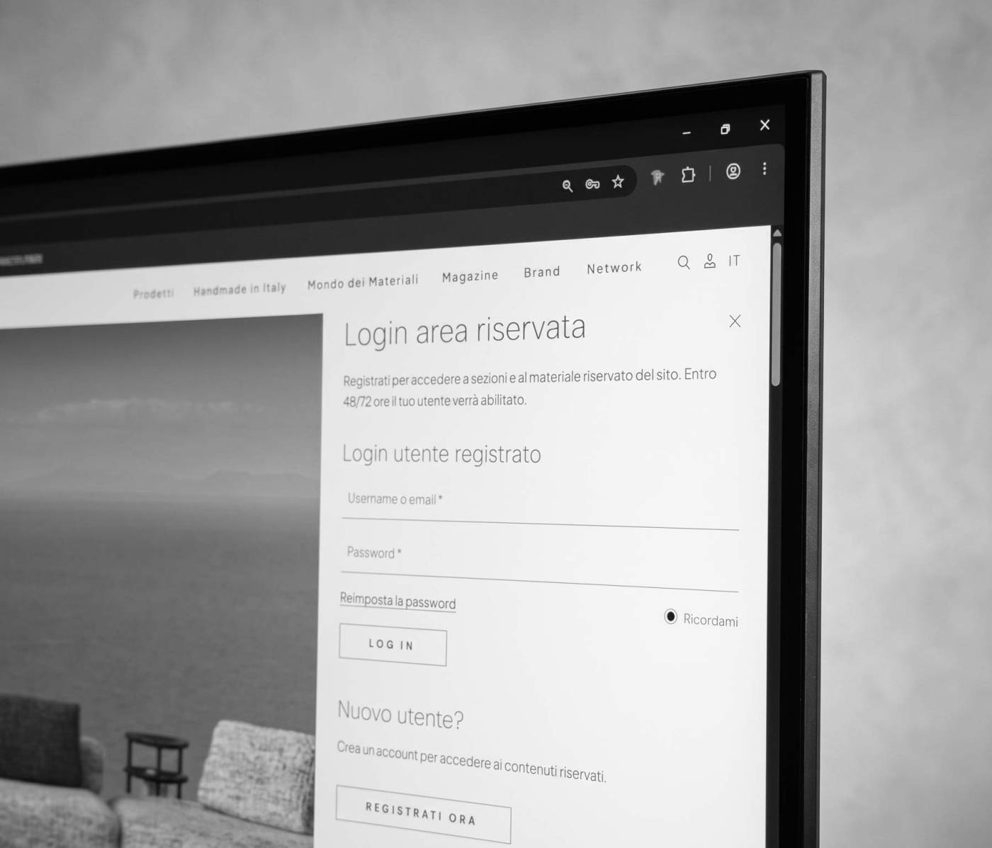
new-visibility-agenzia-comunicazione-marketing-digitale-cantu-realizzazione-siti-web-login-area-riservata-utente
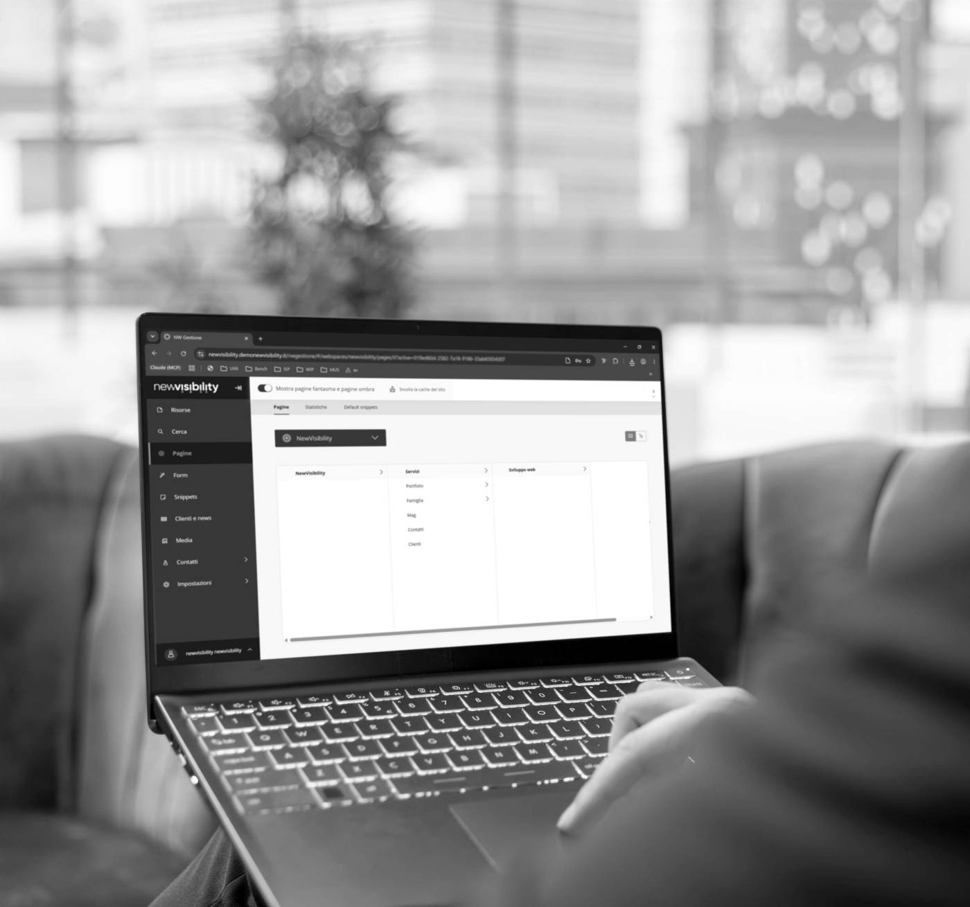
new-visibility-agenzia-comunicazione-marketing-digitale-cantu-gestionale-backend-csm
NewVisibility, communication and digital marketing agency in Cantù
new-visibility-agenzia-comunicazione-marketing-digitale-cantu-provincia-como-ecommerce-black
  • Headline: states the topic of the page
  • Subheading: introduces and guides
  • Body text: readable in size and line spacing
  • Captions and notes: secondary but always clear
Identity

Consistency with your brand

Typefaces must be chosen consistently with the company's style. If your brand already has defined fonts we respect them; to create or review them there is the Visual identity and logo service.

new-visibility-agenzia-comunicazione-marketing-digitale-cantu-siti-web-ecommerce.programmazione-home
Portfolio

Our work in the field

Want a more readable publication?

Write to us: we work with companies in Como, Milan and Canton Ticino.

Services of interest

White space in a layout gives the page room to breathe and makes a few carefully chosen images stand out, alternating full and lighter pages for a good reading rhythm. In the projects we follow from Cantù for companies in Como, Brianza and Milan, empty space guides the eye and enhances the product.

The cover of a catalogue or a brochure is designed with a clear goal: readable title, strong image and a clearly visible brand, chosen together with paper and finish. In Cantù we design it for companies in Como, Brianza and Milan consistently with the inside pages, so the publication speaks a single language.

To lay out house organs and company reports you need a reusable template, with master pages that accommodate different text, tables and photographs in each issue. From Cantù we build smooth, repeatable layouts for companies in Como, Brianza and Milan, then coordinate printing with local partner printers.

A print-ready PDF is exported in CMYK, with embedded fonts, suitable images, bleed and crop marks, according to the printer's requirements. In Cantù, in the province of Como, we prepare PDFs for catalogues, brochures and leaflets.

An in-house graphics, photo and video team works in the same studio: it designs the layout, produces the images and follows printing with a single point of contact. NewVisibility, in Cantù in the province of Como, makes it available to companies in Como, Brianza and Milan.

Login reserved area

Register to access sections and restricted site content. Your user will be enabled within 48/72 hours.

Login registered user

New user?

Create an account in order to access the reserved contents.