A frequent mistake is wanting to use every available centimetre. In the work we do in Cantù for companies in Como, Brianza and Milan, empty space guides the eye and enhances the product.
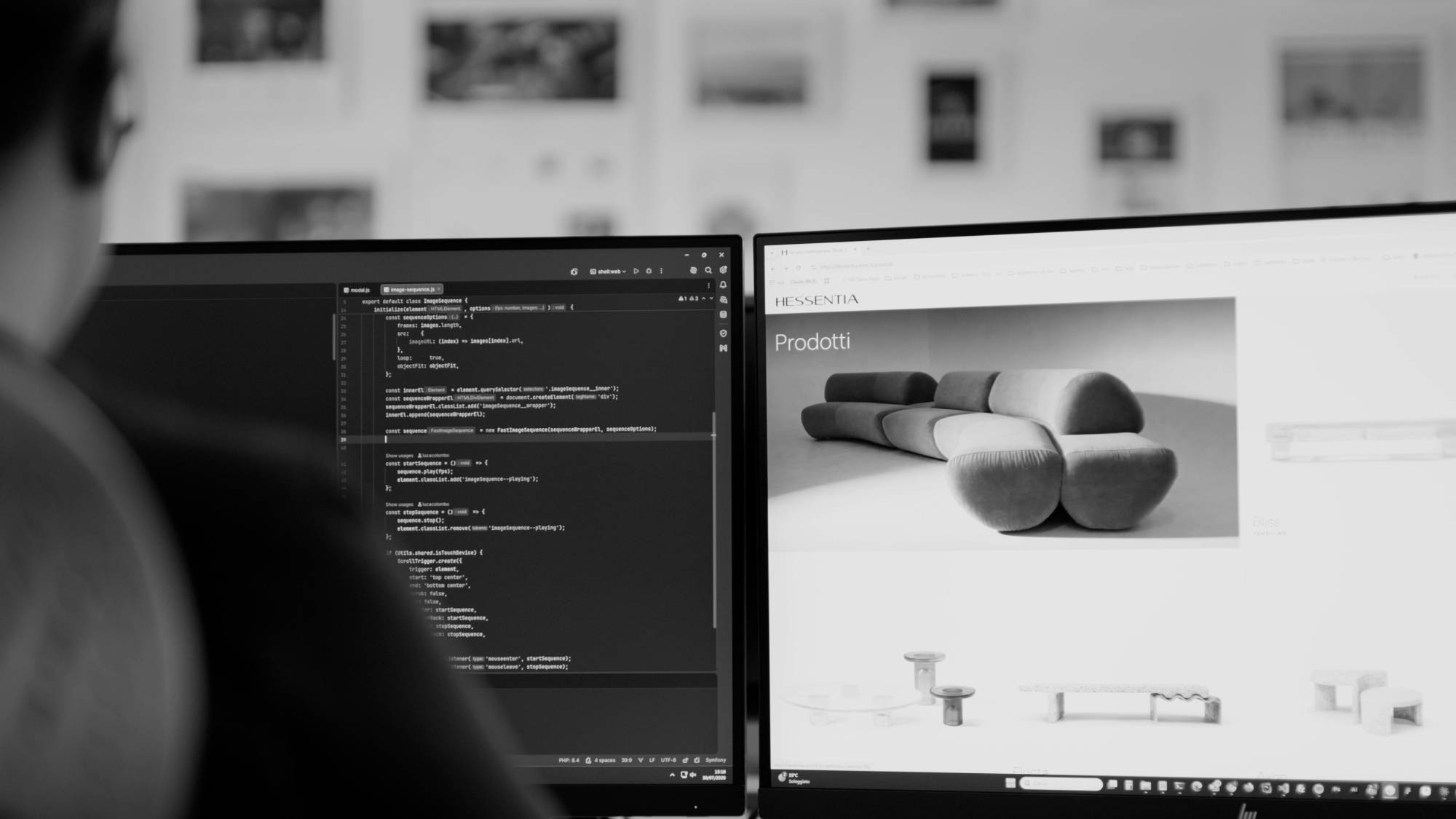
How to use images on the page
A few large, well-chosen photos communicate more than many small images. Rhythm matters too: alternating full pages and lighter pages makes reading enjoyable.


The cover of a catalogue or a brochure is designed with a clear goal: readable title, strong image and a clearly visible brand, chosen together with paper and finish. In Cantù we design it for companies in Como, Brianza and Milan consistently with the inside pages, so the publication speaks a single language.
To lay out house organs and company reports you need a reusable template, with master pages that accommodate different text, tables and photographs in each issue. From Cantù we build smooth, repeatable layouts for companies in Como, Brianza and Milan, then coordinate printing with local partner printers.
A printed piece becomes a flippable PDF starting from the layout file, adapted for on-screen reading, made lighter and placed on the website. In Cantù we prepare the digital version of catalogues and brochures for companies in Como, Brianza and Milan, ensuring readability on smartphones too.
An in-house graphics, photo and video team works in the same studio: it designs the layout, produces the images and follows printing with a single point of contact. NewVisibility, in Cantù in the province of Como, makes it available to companies in Como, Brianza and Milan.
A catalogue that helps to sell starts with an opening that presents the company, groups products logically, uses readable product sheets and ends with contacts and a call to action. NewVisibility, in Cantù near Como, designs it around how customers in Brianza and Milan choose.