What makes the new Erba Idea logo distinctive?

erba-idea-progettazione-logo-2.jpg
Soft lines and an inverted «i»: the Erba Idea logo.

The new Erba Idea logo has a logotype with soft, curved lines reminiscent of the shape of a sofa. At NewVisibility, a graphic design agency in Cantù, in the province of Como, we designed it starting from one detail: the inverted «i».
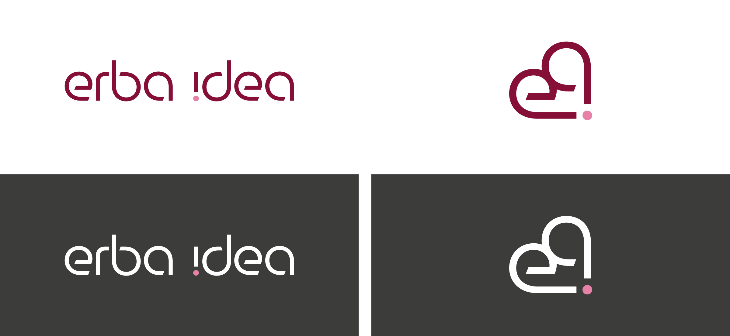
The inverted «i»

A detail that recalls an exclamation mark and is the brand's distinctive feature.

The monogram

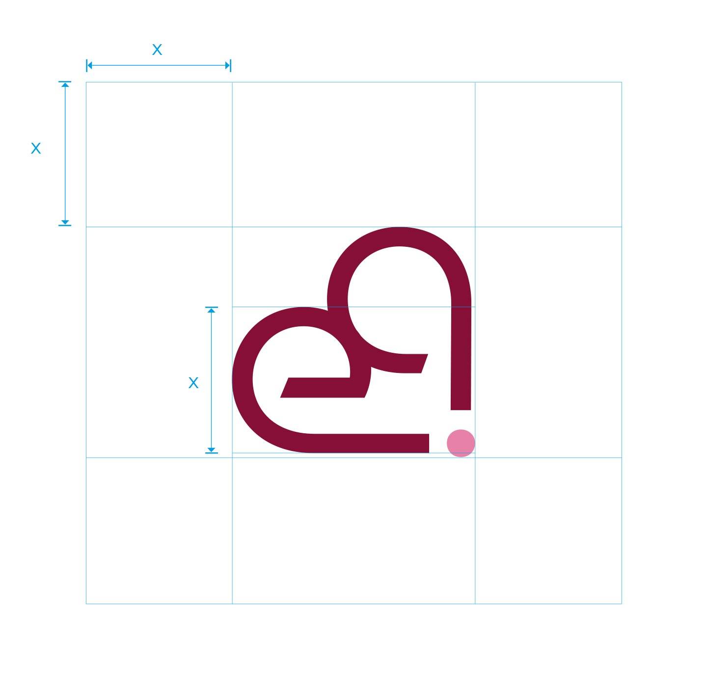
The monogram works on its own, for example on a label or a social media profile.

The colour palette

The colours stand out from those of competitors and are available in several variants.

new-visibility-agenzia-comunicazione-marketing-digitale-cantu-provincia-como-logo-brand-erba-1
new-visibility-agenzia-comunicazione-marketing-digitale-cantu-provincia-como-logo-brand-erba-7
new-visibility-agenzia-comunicazione-marketing-digitale-cantu-provincia-como-logo-brand-erba-4
The logo

A brand that is recognisable even at a small size

The soft-lined logotype is designed to be recognisable even at a small size, thanks to the monogram and a distinctive colour palette.

If you need to create a logo for your company in Como, in Brianza or anywhere in Italy, at NewVisibility we start from a detail that makes you unique.

Talk to us about it
erba-idea-progettazione-logo-3.jpg
At a glance

The logo in brief

A soft mark and a detail that sticks in the mind.

Logotype
Soft, curved lines
Detail
The inverted «i», like an exclamation mark
Monogram
Recognisable even on its own
Produced by
NewVisibility, Cantù (Como)
Portfolio

Projects in our portfolio

Contact

Want a logo people remember?

We design your logo from our base in Cantù.

Contact us
erba-idea-progettazione-logo-4.jpg

Login reserved area

Register to access sections and restricted site content. Your user will be enabled within 48/72 hours.

Login registered user

New user?

Create an account in order to access the reserved contents.