Why is the Erba Idea rebrand built on "continuity and renewal"?

new-visibility-agenzia-comunicazione-marketing-digitale-cantu-provincia-como-logo-brand-erba-4
A rebrand that does not erase Erba Idea's history.

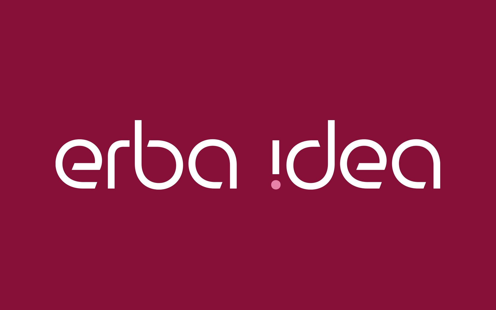
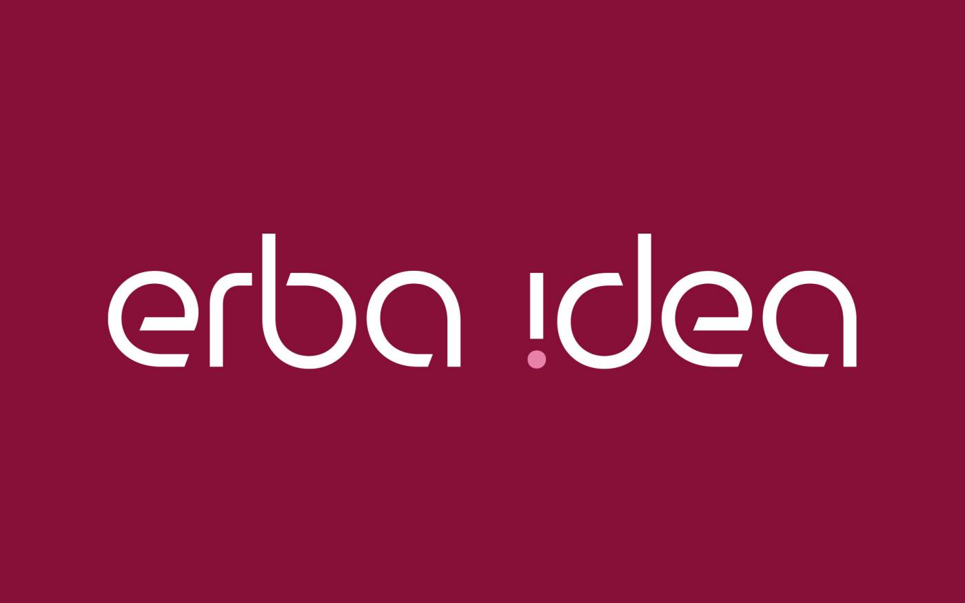
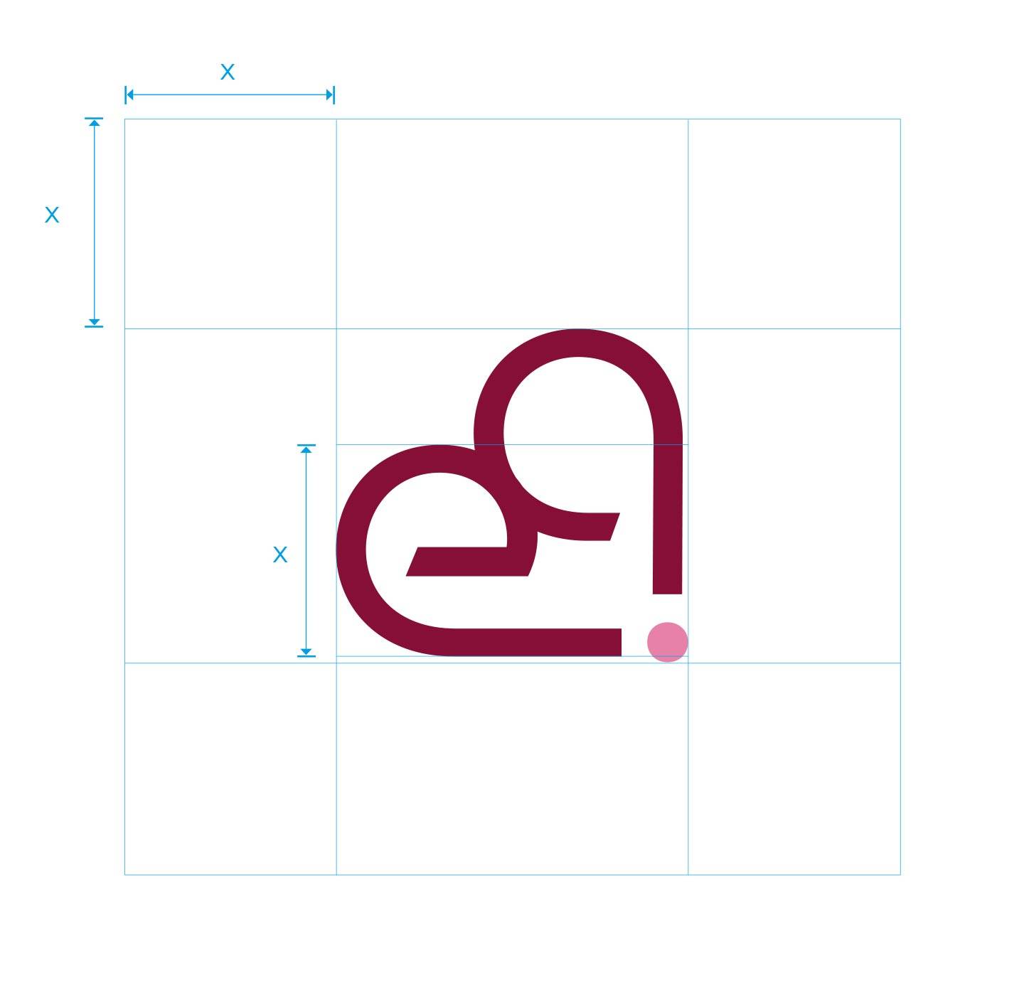
For Erba Idea, the concept was continuity and renewal: the new logo is an evolution of the previous mark. We at NewVisibility, a branding agency in Cantù, in the province of Como, guided the brand through a fresh start without a clean break.


An evolved logo

The new logo is an evolution of the previous mark, not a clean break.

Palette and fonts

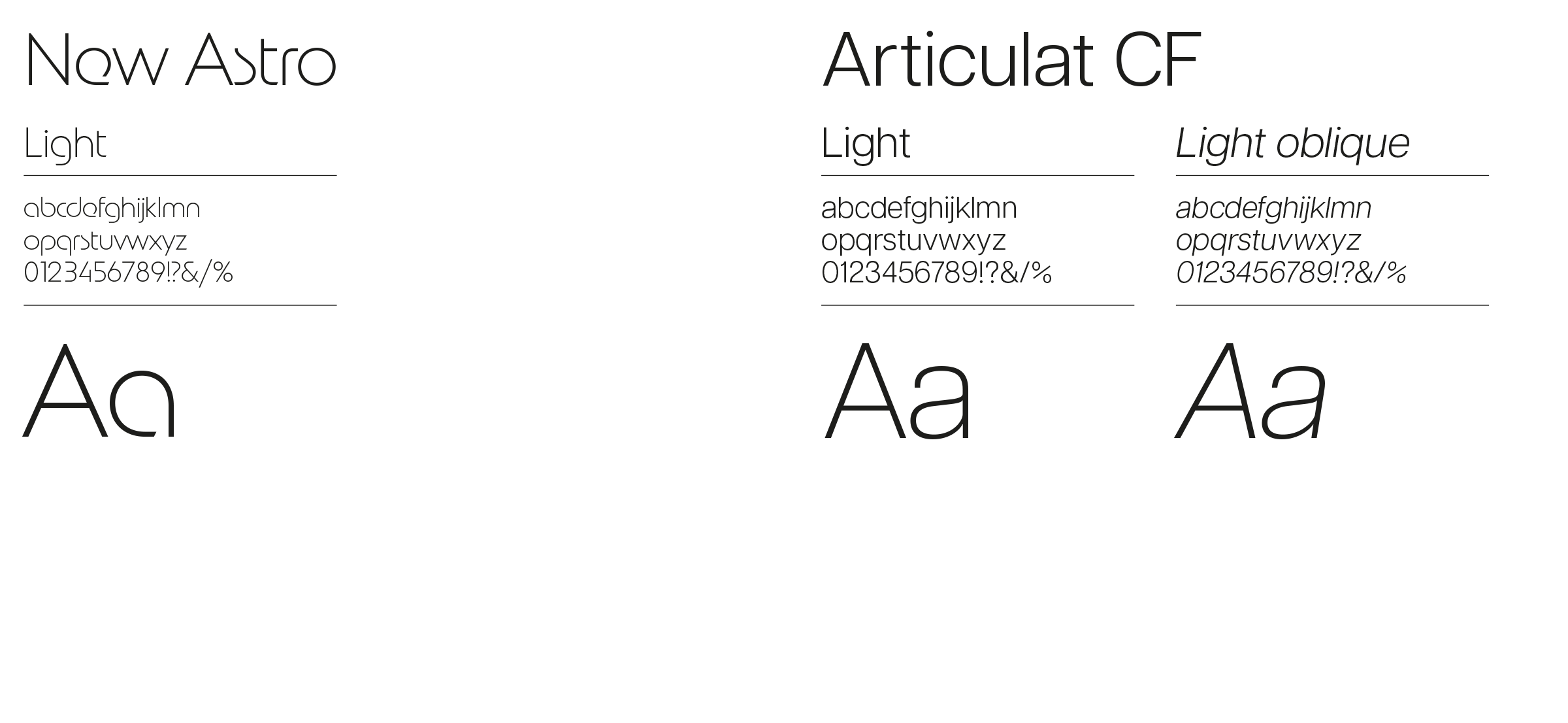
The work includes the colour palette and the font research.

Photographic mood

The photographic mood and application proposals complete the identity.

new-visibility-agenzia-comunicazione-marketing-digitale-cantu-provincia-como-logo-brand-erba-2
erba-idea-progettazione-logo-4.jpg
new-visibility-agenzia-comunicazione-marketing-digitale-cantu-provincia-como-logo-brand-erba-8
Rebranding

Craft tradition and healthy creative madness

We worked on several elements together: logo, colour palette, font research, photographic mood and application proposals, so that the brand conveys both the craft tradition and the healthy creative madness that drives it.

If your company wants a fresh start without losing its history, in Como, Brianza or elsewhere in Lombardy, a well-built rebrand is what you need.

Talk to us
erba-idea-progettazione-logo-2.jpg
At a glance

The rebrand in brief

A complete identity, built on the past.

Concept
Continuity and renewal
Elements
Logo, palette, fonts and photographic mood
Year
2026
Produced by
NewVisibility, Cantù (Como)
Portfolio

Projects in our portfolio

Contact

Want to refresh your brand?

Let's start again together from our base in Cantù.

Contact us
erba-idea-progettazione-logo-3.jpg

Login reserved area

Register to access sections and restricted site content. Your user will be enabled within 48/72 hours.

Login registered user

New user?

Create an account in order to access the reserved contents.