Logo design
For Si.Safety we developed a logo based on a concept closely tied to the company's core business: risk assessment and management.
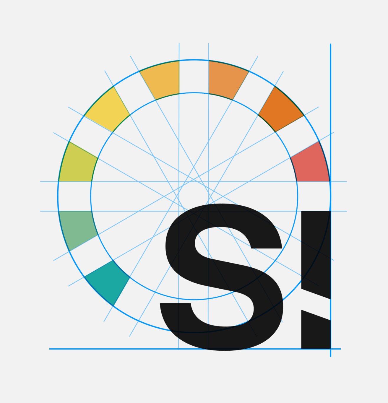
The main graphic element is a colour-coded risk scale, represented by a sequence of coloured tiles that instantly communicate the different levels of hazard. This visual choice turns a technical concept central to the company's work into a simple, intuitive form.
The circle enclosing the tiles represents the completeness of the assessment system and the continuity of the analysis and safety process. Within this structure, the letters “Si” become an integral part of the symbol, creating a compact mark that remains recognisable even at small sizes.
The typeface is a modern sans serif, chosen to convey a solid, up-to-date, innovation-oriented corporate image. It has also been customised to make it more recognisable and strengthen the brand identity.
The result is a versatile, functional logo designed to adapt easily to digital and institutional contexts, including use as a profile icon on the main online tools.