

Logo design
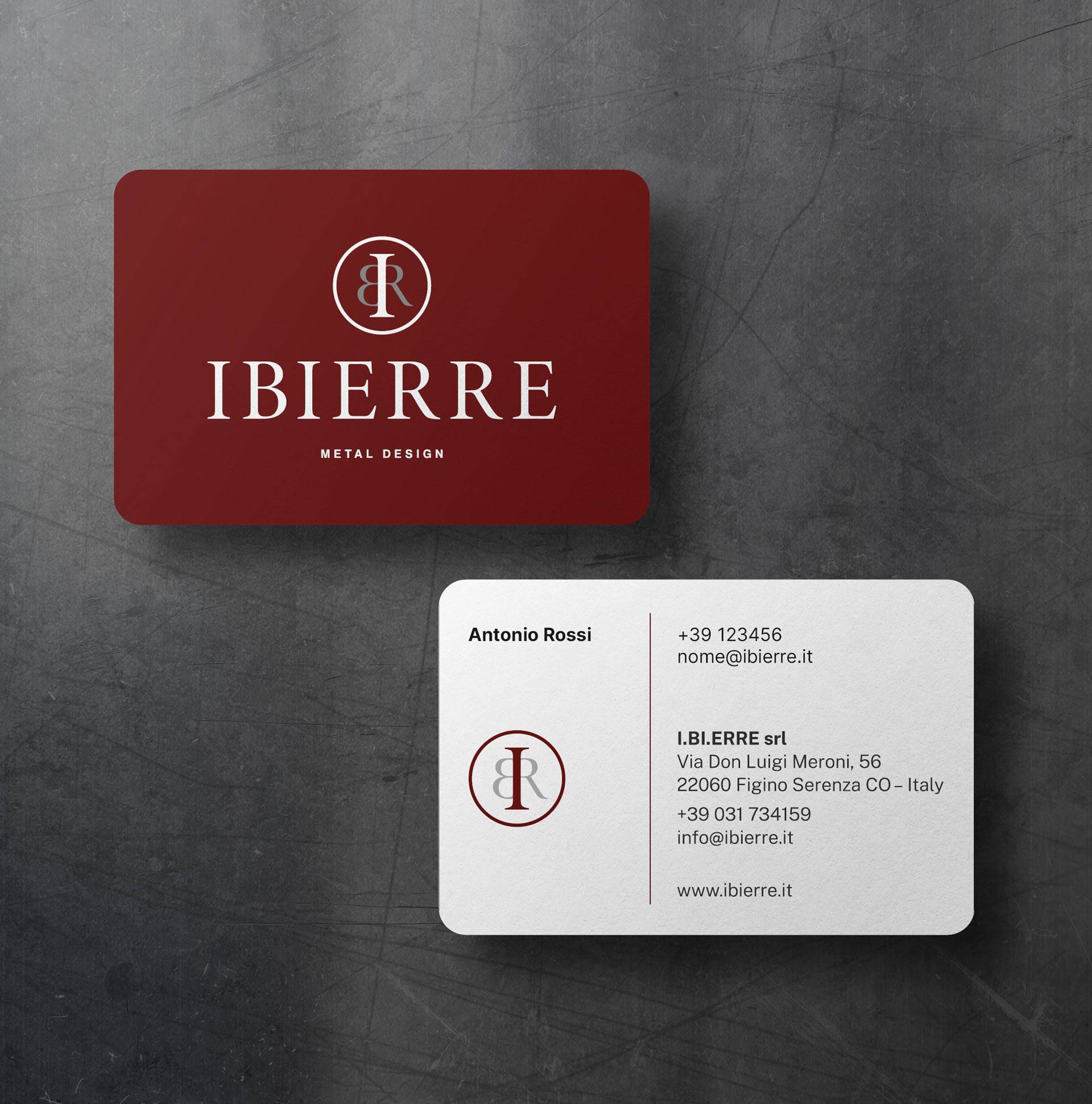
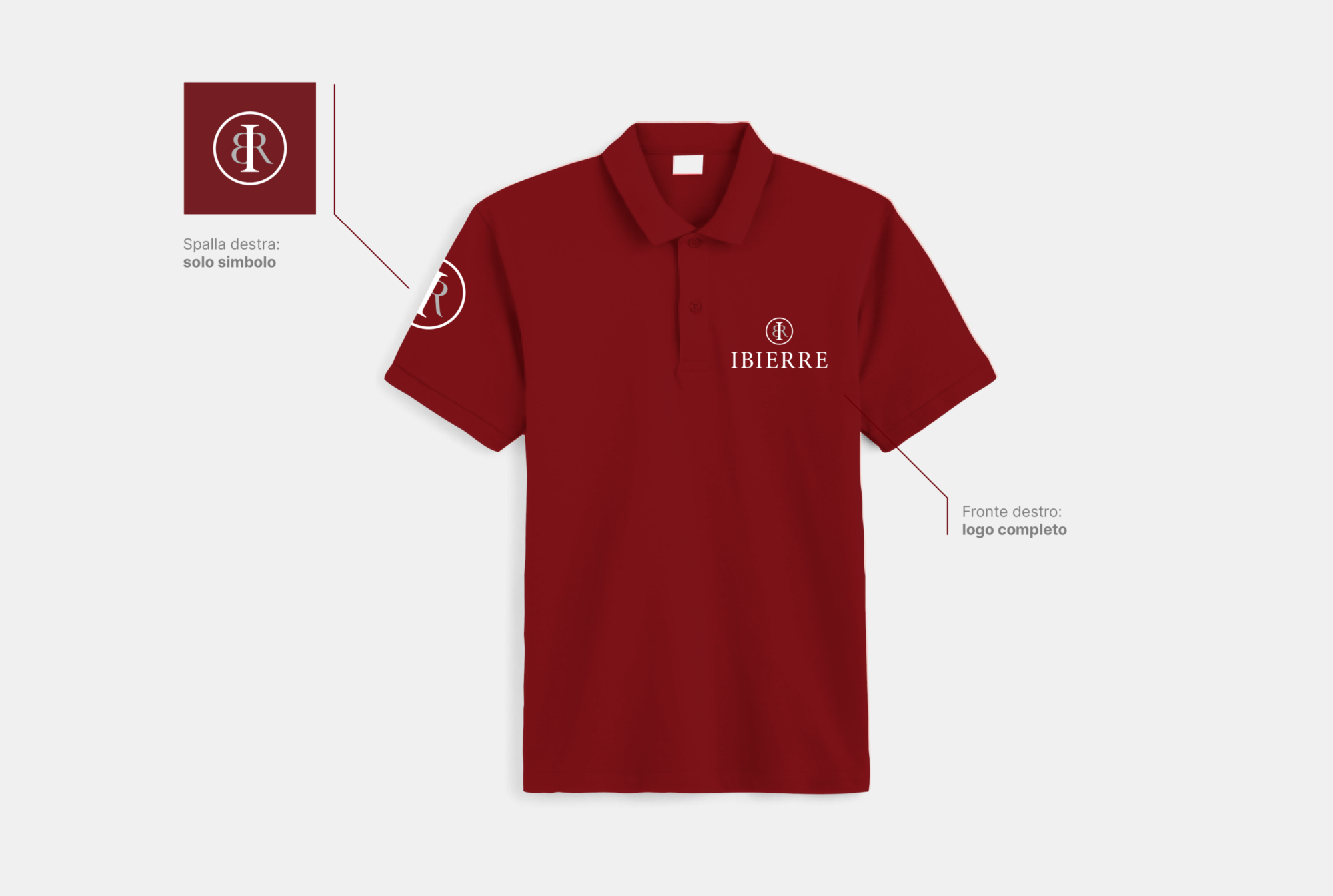
The team of graphic designers at our marketing agency in the province of Como has created a distinctive logo for Ibierre, the result of an in-depth analysis of the company’s values and objectives. The logo emphasises the elegance and refinement that characterise the company’s bespoke metalwork. A skilfully designed monogram, formed by combining the name ‘Ibierre’, becomes the beating heart of the new visual identity. Beneath this graphic design, the word ‘Ibierre’ unfolds in a serif typeface, an elegant dance of letters that evokes the sophisticated essence sought by a high-end clientele.
The colour burgundy was chosen to enhance the aura of prestige. Every stroke emphasises the union of precision and creativity, offering not only a visual symbol but a tangible expression of Ibierre’s dedication to artisanal perfection and timeless elegance.