
How do you design the graphics of the profile page?

The graphics of the profile page of an NFC card are designed for the smartphone: little information, a clear hierarchy and a style coordinated with the brand.

The page is hosted on the company's domain and linked to the website: that is why it can echo the same style, the same tone and the same content, as in a bespoke website. We design it in Cantù for companies in Como, Brianza, Milan and Lugano.
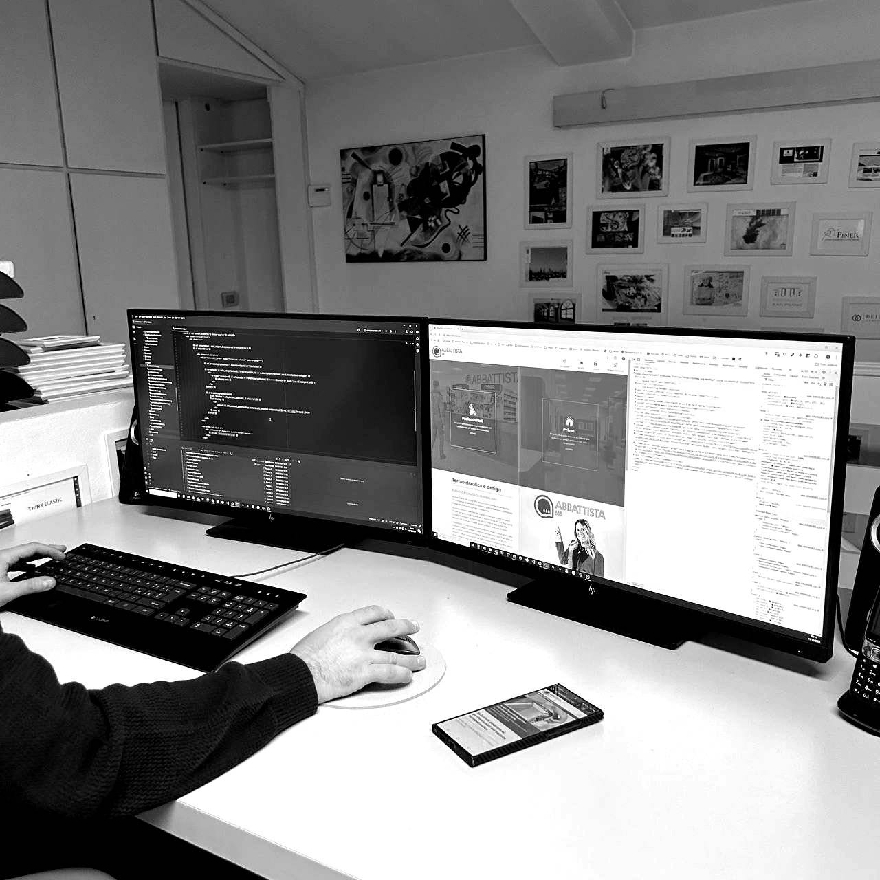
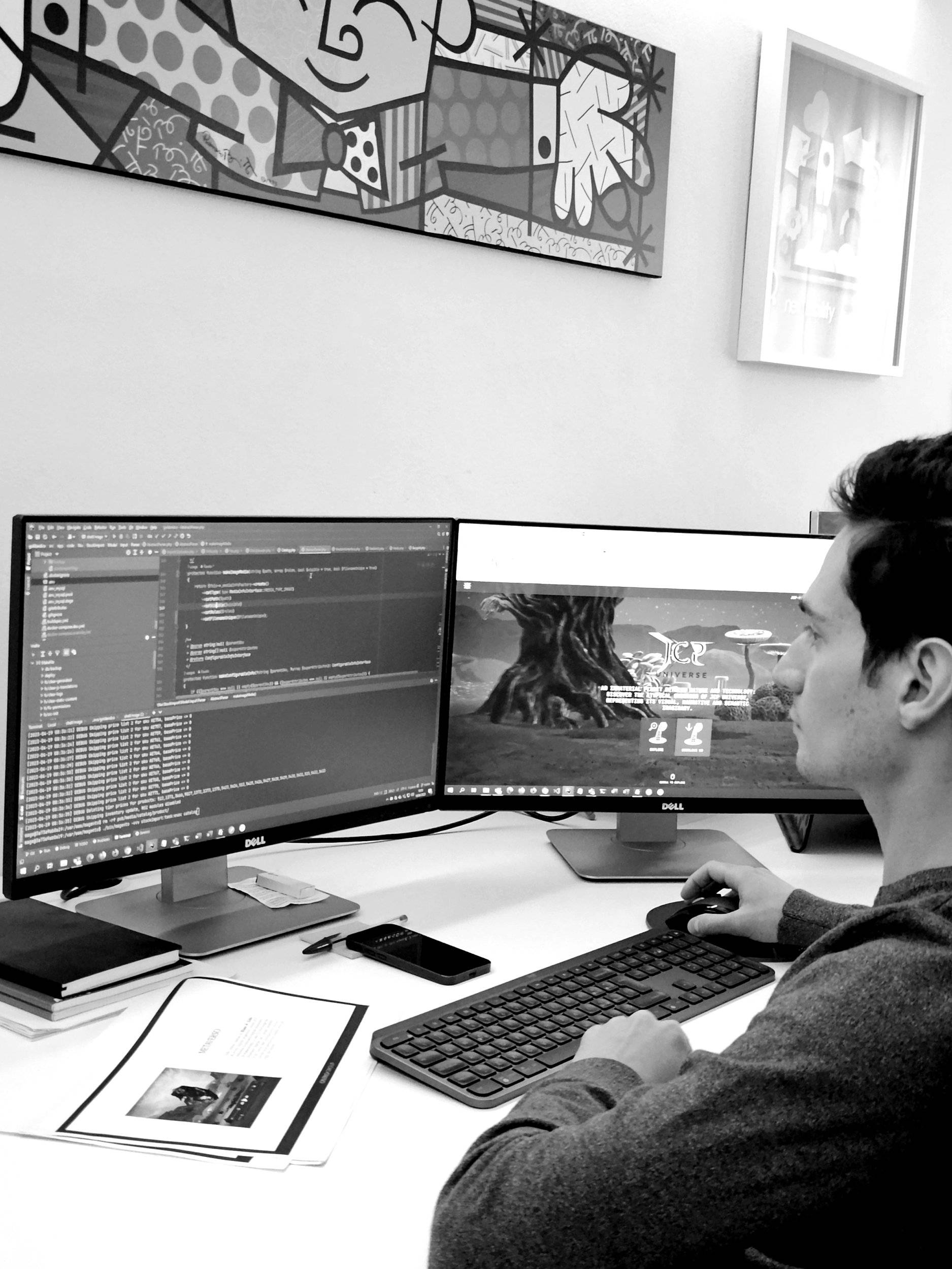
realizzazione-siti-web-sviluppo-web-02
realizzazione-siti-web-sviluppo-web-01
Layout

Designed for the phone

Whoever opens the profile wants to find your name, role and ways to contact you straight away.

Principles

What to focus on in the profile

A few rules guide the graphic design.

Hierarchy
key information first
Readability
clear text and contrast
Consistency
brand style
Actions
buttons that are easy to tap

Let's design your digital profile

Write to us from Como, Milan or Lugano to talk it over.

Services of interest

To make it clear that the card is read with a smartphone, a short, visible hint is enough, such as an icon or a call-to-action phrase near the chip and the QR code. Not everyone knows NFC: an explicit invitation avoids hesitation, including for companies between Como and Milan that we serve from Cantù.

NFC tags in formats other than the card are a possibility to be assessed during the project phase, depending on where and how you want to use the link to the digital page. We do not promise formats in advance: we discuss it case by case with companies in Como, Brianza, Milan and Lugano from our studio in Cantù.

To make the NFC card recognisable and distinctive you need a clear graphic idea, consistent with the brand and repeated in every detail. The page the card opens also matters, with images, video and content crafted by our team in Cantù, for companies in Como, Brianza, Milan and Lugano.

A QR code customised with the logo is assessed during the project phase, together with the card's graphics. The aim is to keep it readable and consistent with your company's style; each case is defined together, from Cantù, for companies in Como, Brianza, Milan and Lugano.

To keep a consistent image across the team's cards, you use a single template based on the company's visual identity: same logo, colours, fonts and structure. Only the personal details change. We build it in Cantù for companies between Como, Milan and Lugano.

Login reserved area

Register to access sections and restricted site content. Your user will be enabled within 48/72 hours.

Login registered user

New user?

Create an account in order to access the reserved contents.