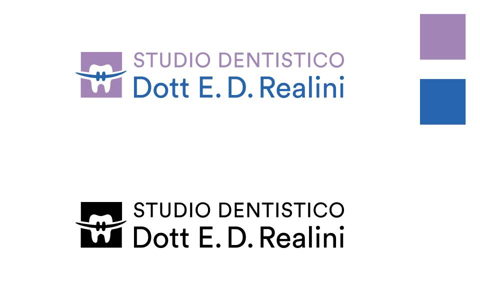
A tooth, a brace and two colours the practice already had.
In 2021 we carried out the logo redesign for Studio Dentistico Realini, starting from the existing logo and its colours, lilac and blue. As the doctor specialises in orthodontics, the subject is a tooth with an illustration recalling an orthodontic brace. At NewVisibility, a communication agency in Cantù, in the province of Como, we made it modern, legible and versatile across all media.