Why does the Studio Realini website use the practice's own colours?

realini-studio-dentistico-inverigo-studio-1.jpg
A website that looks like the practice removes one fear before the appointment.

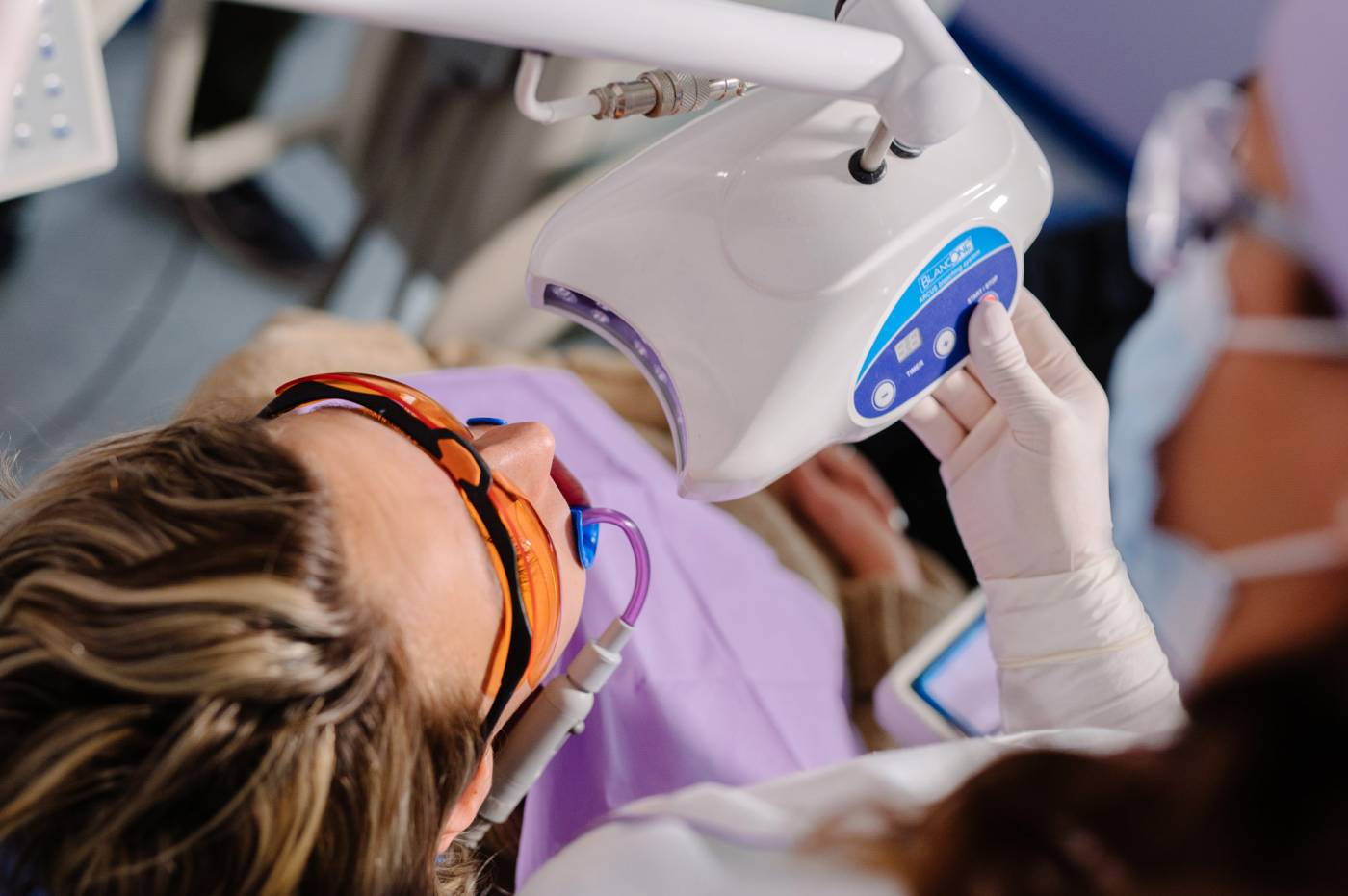
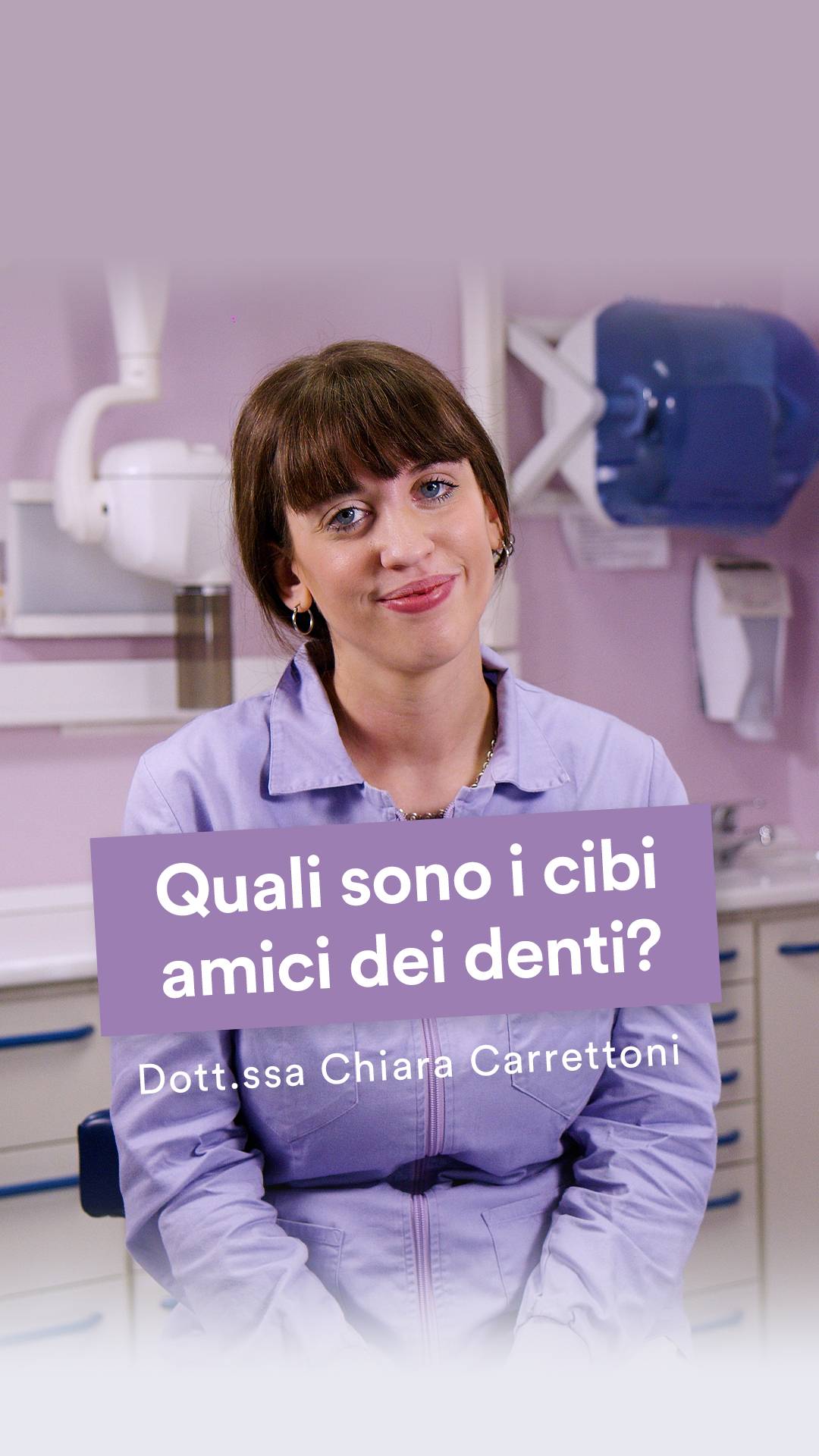
For the website we used the logo colours, lilac and blue, and the relaxing, welcoming colours of the practice's furnishings in Inverigo. In dentistry, anxiety is the first barrier, especially when addressing families: showing in advance the environment the patient will find narrows the gap between expectation and reality. We at NewVisibility, a communications agency in Cantù, in the province of Como, always start from here.

Environment

From the waiting room to the screen

Colours are not a decorative choice: they prepare patients for what they will find when they walk through the practice door.

Looking for a web agency in the province of Como that builds your website starting from your practice? We would be glad to hear from you.

Write to us
realini-studio-dentistico-inverigo.jpg
At a glance

The colours in brief

The website prepares you for the real environment.

Visual identity
Colours of the logo and furnishings
Palette
Lilac and blue
Goal
Reduce first-appointment anxiety
Year
2021
Produced by
NewVisibility, Cantù (Como)
Portfolio

Projects in our portfolio

Contact

Want a website that looks like your practice?

See you at our office in Cantù.

Contact us
realini-studio-dentistico-inverigo-3.jpg

Login reserved area

Register to access sections and restricted site content. Your user will be enabled within 48/72 hours.

Login registered user

New user?

Create an account in order to access the reserved contents.